

SCAFCO
SCAFCO Corporation resides in Spokane Washington. They manufacture steel studs and grain bins. We will be looking at the cover of their product technical guide for the steel stud division. This cover shows the steel studs being used in a large warehouse project. With the demising wall reaching from the floor all the way to the roof of the warehouse. This is a good depiction of the skeleton of a wall that uses steel studs.
We will be taking a look at SCAFCO’s SSMA Product Technical Guide and how the cover catches our eyes with the various visual marketing techniques using; contrast, repetition, alignment, proximity, and color.
Contrast

Contrast was used in this catalog cover by adding a dark background to the catalog title and utilizing white text for the title. This helped the text to stand out on a picture that would have otherwise drowned it out. They also used a bold font that helped bring out the title of the catalog.
Repetition

Repetition was used to keep the catalog cover uniformed. The cover uses the same font for the title, the subtitle, and the tag line above the title. The only difference is that the tag line uses italics to make it stand out a little.
Repetition also helps the reader to see that the rest of the catalog (not shown) belongs to this cover by duplicating the SSMA logo throughout. This helped to show that all of these pages are related to each other and to the cover.
Alignment

Alignment is used to help the catalog look professional. By aligning the right side of the logo at the top of the cover with the right side of the title, tagline, and certification icons. They also did a good job of aligning the left side of the tagline and title to help keep it uniform. The top of the SSMA logo and the title next to it are also aligned.
Proximity

Proximity is used to show relation between the SSMA logo, the title, tagline and certifications. It is also used to show the relationship between the title and the subtitle below it. The certifications are all grouped together in the bottom left of the cover to show that they are the same type of content and helps us to know that all of these items are related.
Color
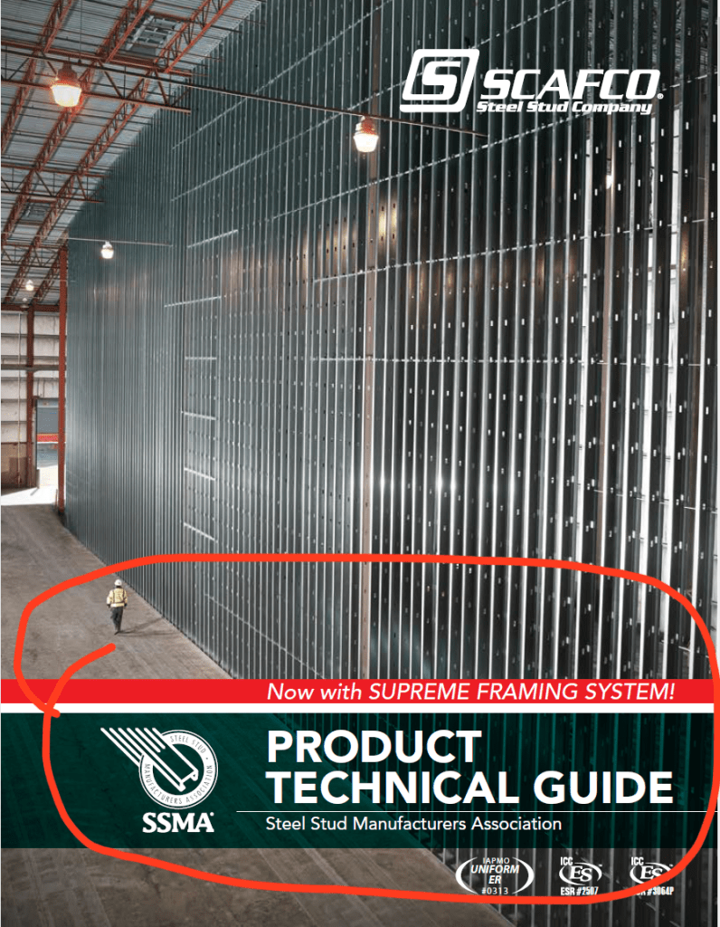
Color is used to help bring attention to the title and the tagline. The red tagline above the title tells us that this product that is “Now with SUPREME FRAMING SYSTEM!” is important and is a good contrast from the dark background of the title below it. We know this is important, because it is the only red on the entire cover. It helps to bring our eyes to this part of the cover. Which then leads us to the title of the cover right below it.
SCAFCO’s Visual Media
SCAFCO’s use of the above visual media techniques helps the viewer to know what is important and how they are related to each other. Their use of alignment was the best used technique. Everything on the page has a place and is related to other items on the cover. They did a good job of using a combination of contrast, proximity, and color to help us know which items are important and how they are related to each other. Repetition is more noticeable throughout the catalog, but not so much on the cover.
