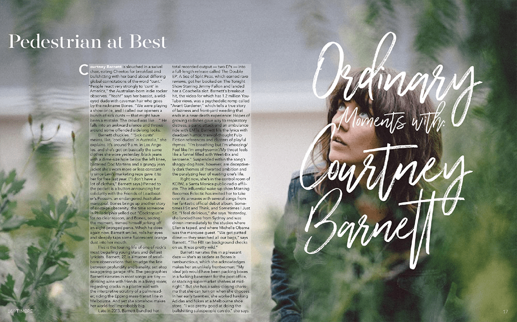
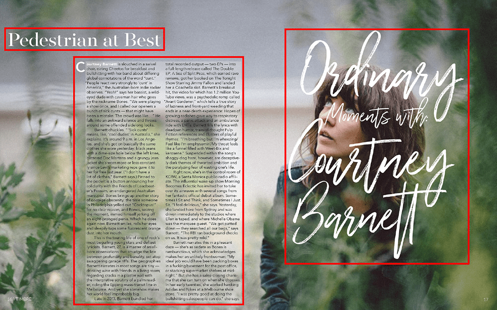
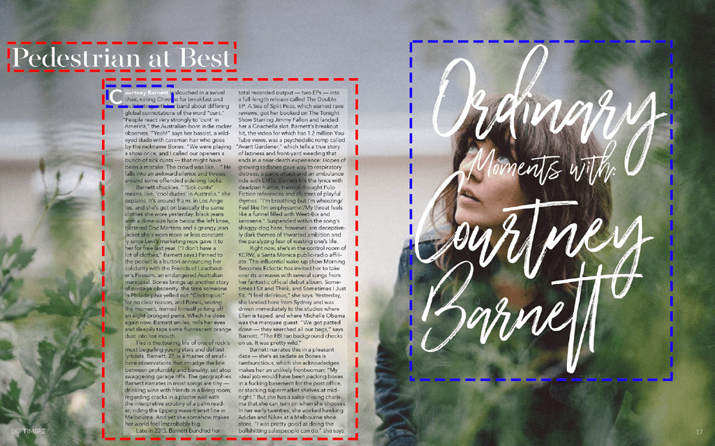
“Pedestrian at Best”, Alexandra Hartman, Timbre Magazine pages 16 & 17, unknown issue.
What makes a good magazine spread?
In this post we will be looking at the typography and photography of the above magazine spread. We will be breaking down why we find this spread interesting and what makes it have that professional design look. Then we will attempt to show these same techniques using different fonts and photos.
Typefaces
In this spread there are three different typefaces. The first one that is used on the title “Pedestrian at Best” is Oldstyle. We can can identify this typeface because of the serifs and the slanted or diagonal stress in the letters. The Oldstyle typeface also has curved bracketing (where the serif meets the stem of the letter). The second typeface is Script. This is identified by the cursive handwritten look of the tagline, “Ordinary Moments with Courtney Barnett”. The third typeface used in the body of this spread is Sans Serif. This is identified by the lack of serifs on the letters.
Contrast
This magazine spread used the three different typefaces to create contrast between the different elements. The title of the spread used an oldstyle typeface that has serifs while the body used sans serif. Other elements that helped with the contrast between the title and the body of the article is the font size of each element. They also started off the article by using a different color for the first two words and enlarging the very first letter off centering it from the rest of the body text.
They also used script on the tagline to bring attention to the spread. The font size is quite large taking up most of the page, making it easier to read and bringing a creative fun element to the article.
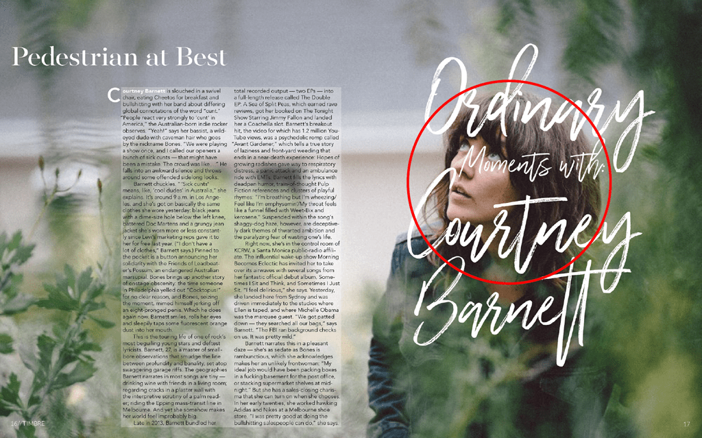
Depth of Field
The picture used in this article is a good example of depth of field. They kept the subject in focus while items in front and behind subject are blurred, creating a depth to the picture. It also helps us to easily identify what part of the photo deserves our attention.
Could these photos replace the original?
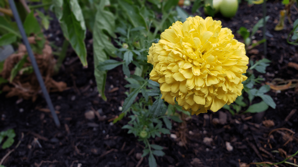
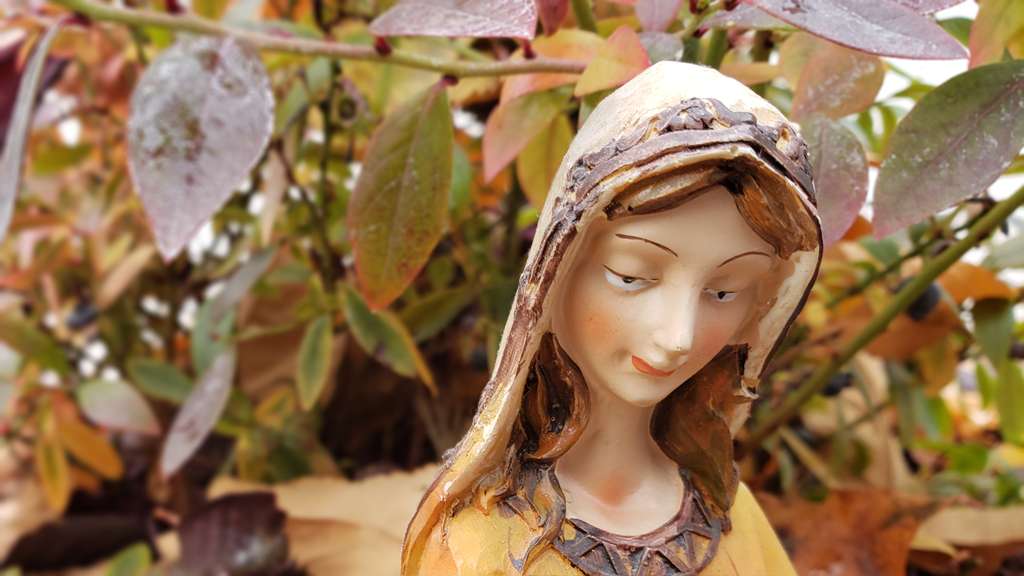

These three photos are more examples of depth of field. The subject is in focus while all other objects are out of focus, or blurred. This helps the viewer to know which item in the photo is the focal point. Any of these photos could be used in place of the original picture. The typefaces and photos would still look like they are all part of the same design.
Final thoughts…
Multiple typefaces and photos are combined to bring attention to articles that are surrounded my so many other items screaming for our attention. When multiple typefaces are used to bring variety and contrast to a page, it is more likely to receive a second glance. While the photo should also bring attention to the article by capturing the viewer’s eye and drawing it into take a second look at the reason for the magazine spread.
