https://www.behance.net/gallery/422288/REI-Ad-Campaign
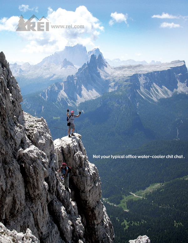
The above is an ad from an REI ad campaign by Kyle Caldabaugh. This campaign has multiple ads showing people out of the office, conquering nature. The designer wanted to show us that sitting behind the desk is not where all of us belong. They showed good use of the logo having it float in the sky, slightly transparent, so it looks like it belongs there as part of nature. The body text is nice and simple, reminding us of where we were and where true adventures are.
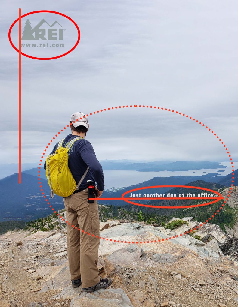
Original REI Ad – Design Principles
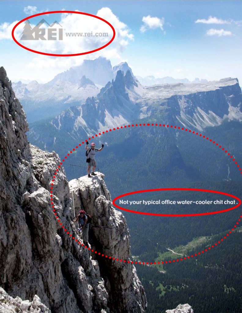
This ad uses the design principles of contrast and proximity. The logo (upper solid red lined ellipse) has been made slightly transparent, but still stands out from the pictures. It give the impression of being part of the clouds by being slightly transparent. It has different colors from the clouds which helps it to stand out. The light color of the body copy (lower solid red lined ellipse) stands out from the dark scenic background. The rule of proximity (dotted red line ellipse) is use to imply that the body copy applies to the two climbers it is close to. They are about the same distance from each other.
The ad campaign uses the design principle of repetition, by having the logo in the same area of the page. It is also the same color on each ad. The body copy on each ad is sans serif and applies to the subjects in the ads.
Original REI Ad – Color
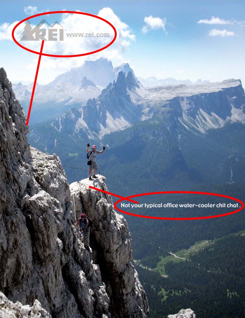
REI’s logo has a slightly brown color to it. This is used well in this ad as it seems to come from the mountainside. The designer also took this chance to match the body copy color to the highlights of the mountain, helping it to stand out from the dark forest background and tie into the mountain beside it.
Original REI Ad – Typography
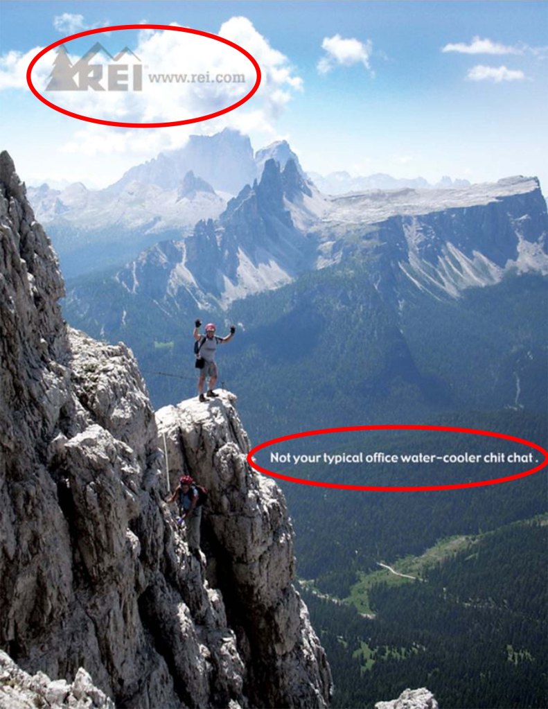
The ad also shows a good use of typography. The logo used block letters. The website that blends in with the logo a modern serif typeface. This was probably done by the designer, so the actual logo stood apart from the website that was added to the logo for this ad. The body copy of the ad is a simple sans serif typeface. These three typefaces work well with each other. The block logo and serif font keep it business like, while the sans serif font of the body copy helps it to keep casual with the subjects of the ad.
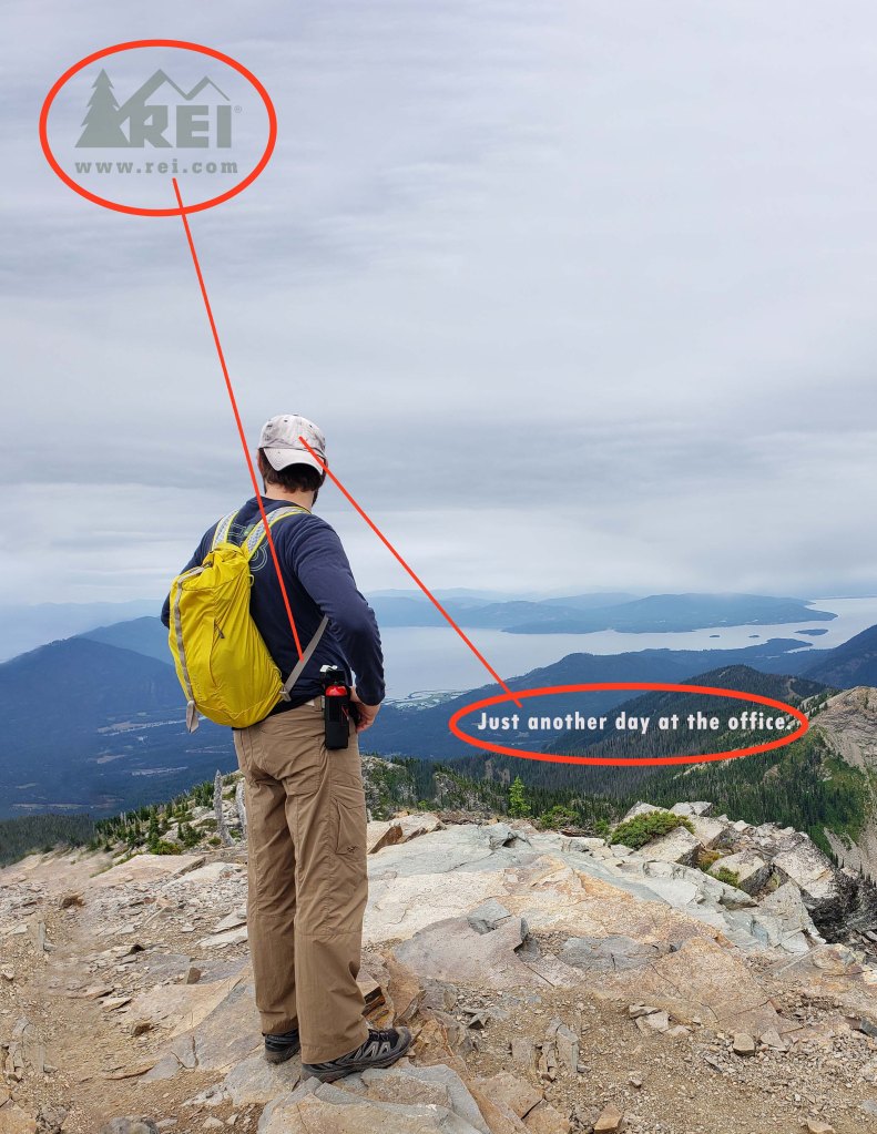
New REI Ad – Design Principles
This new ad uses design principles of contrast, alignment, proximity, and repetition. The contrast of the logo to the sky (solid red line ellipse) and the body copy from the forest behind it help each part to be easily seen. The body copy is aligned with the subject’s hand and the logo is lined up with the peak of the mountain below it. The proximity (dotted red line ellipse) of the body copy to the subject suggests that they are related to each other. The repetition comes in to play with the logo being in the same are as the original. The colors are also repeated in this ad with the type using colors from the photo.
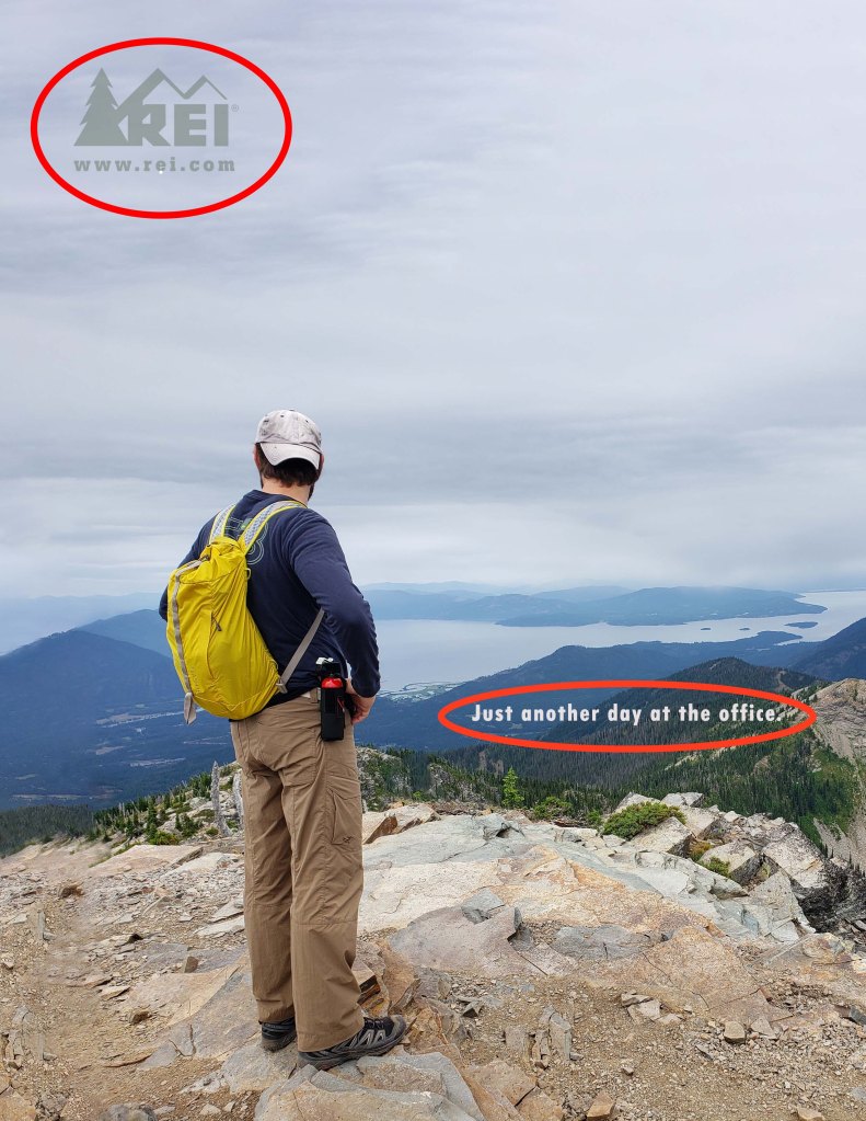
New REI Ad – Color
This new ad shows the use of color in the design, by taking colors from the surrounding picture. The logo uses the same color as the strap on the backpack, while the body copy uses a light color from the hat. The coloring of the photo also helps it to relate to the original ad with the muted colors of the sky and scenery.
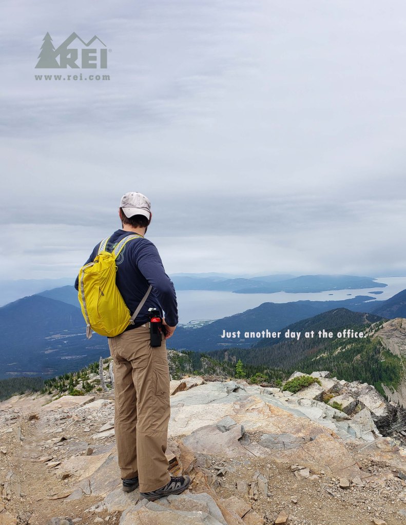
New REI Ad – Typography
This new ad uses the typography as the original ad. The logo uses the same block type face and the website showing a modern serif typeface. The body copy is a sans serif helping the ad to have the casual feel that is wanted with this ad campaign.
REI Campaign

These two ads work well together using the design principle of repetition. Both ads show the company logo in the upper left corner of the add, approximately 3/4″ from the edge. Logos are similar colors and slightly transparent in the sky of the photo used. Both ads show subjects conquering mountains with similar color schemes. Each ad has a body copy mentioning that this is not the typical day at the office.
